Jan 18, 2024
Honest Yoga is the type of yoga studio where you feel truly at home after your first class.
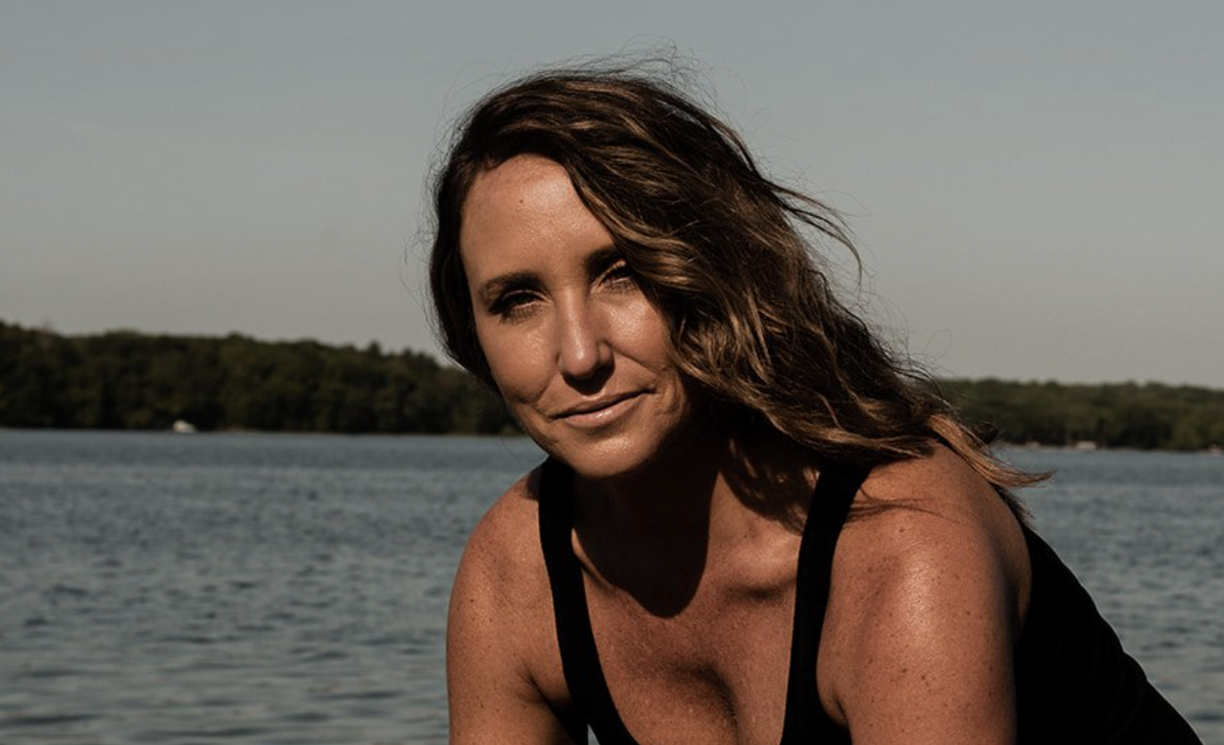
Their founder, Nicole, has a refreshing approach to movement and yogic philosophy that captivates people from all walks of life to build community on their mats.
After working with Nicole for more than 6 months on marketing strategy, the time came to look at refreshing their brand and creating a new website.
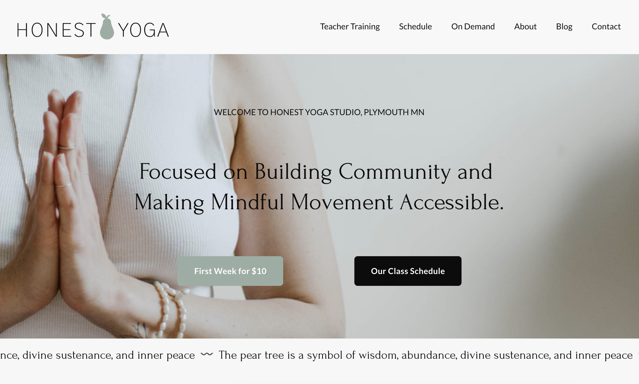
Honest Yoga needed a brand and website that showcased the incredible studio community and the team’s signature, honest take on movement.
The Project Goals
It’s a special opportunity to work with a founder with such a clear vision and a business with such a strong community. It made the entire rebrand and website project a true joy.
I’ll be honest (pun intended) I’ve been to my fair share of yoga classes that felt pretty elitist. I’ve left classes feeling bad about my skills and wishing I was ‘better’ at yoga.
Working with Nicole was a fresh take on yoga studio culture and we wanted to showcase that with the copy, colour palette, imagery, and strategy of the new brand and website.
The goals for the project included:
- Select a new brand name
- Create a brand guide with a color palette, fonts, and imagery
- Build an SEO-optimized Squarespace website
- Project manage the implementation of the new branding
- Update social media messaging & bios
The Branding
After brainstorming and strategizing the new studio name, Nicole selected Honest Yoga — a name that reflected the values of her studio and her approach to the philosophy and mindset around movement.
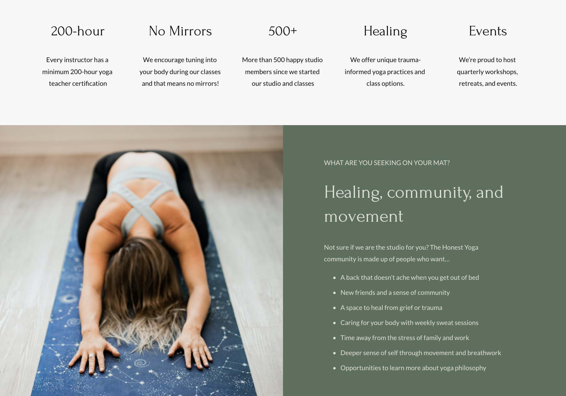
The pear shape logo came from the pear tree symbol and how connected Nicole felt to the meaning and history of the image. Pears are often associated with abundance, femininity, and longevity, which fit perfectly with the space Nicole wanted to create with her studio.
We created a brand guide that featured elegant, calming colors and elevated fonts.
Using elevated visuals and a casual, authentic tone in the copy combined to create a down-to-earth yoga brand. As part of our focus on more accessibility in the yoga space, we prioritized imagery that showed simple movements and poses — no contortions on the beach here!
The Website Copy
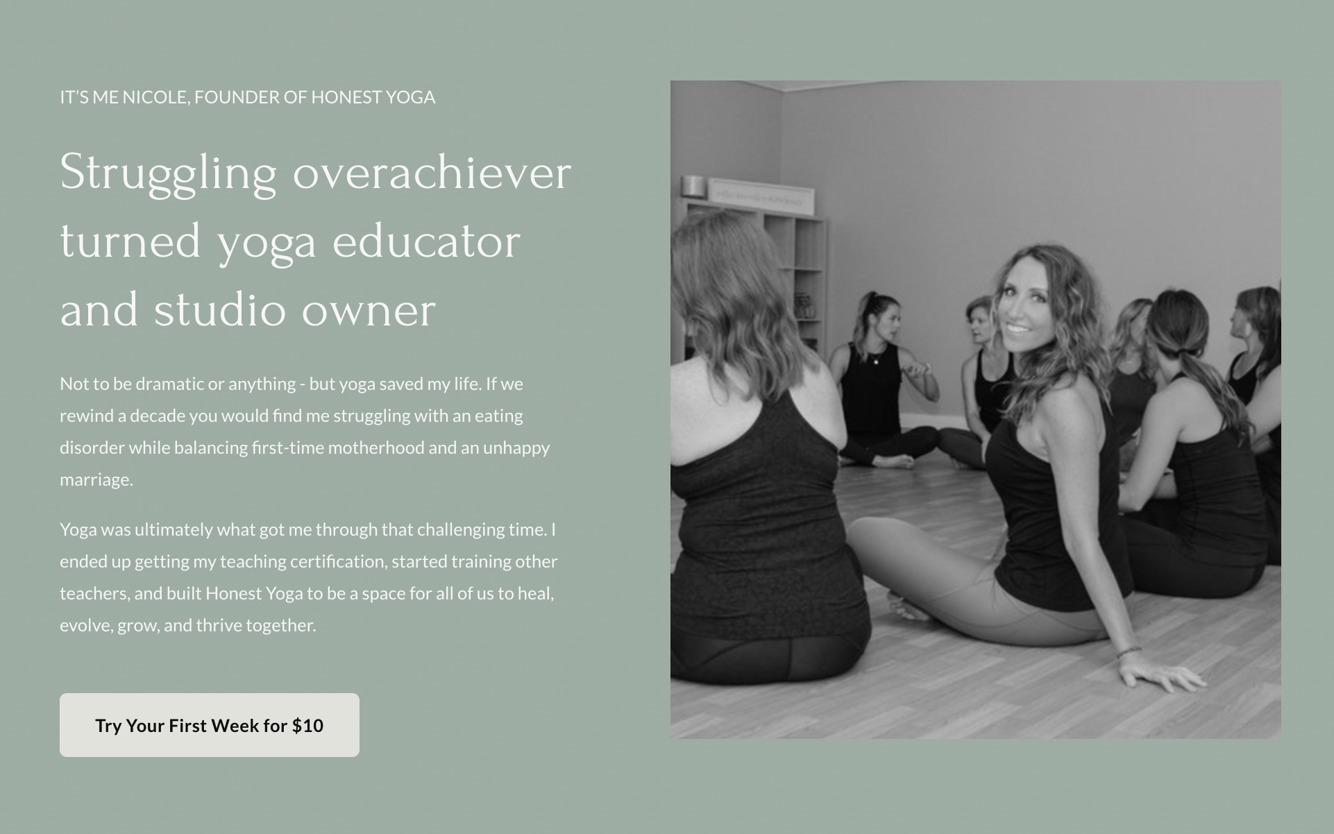
We built the website with customer experience top of mind.
We wanted the website to guide the community to key areas like the class schedule, the first-week deal offer, and the blog.
Squarespace was a great platform for ease of use for the Honest Yoga team and allowed us to create new landing pages for different programs as needed.
The copy was so fun to work on because we wanted the language to sound very personable and casual to almost counteract the soft colours and imagery.
I mean, we addressed pain points head-on! Like the section that says:
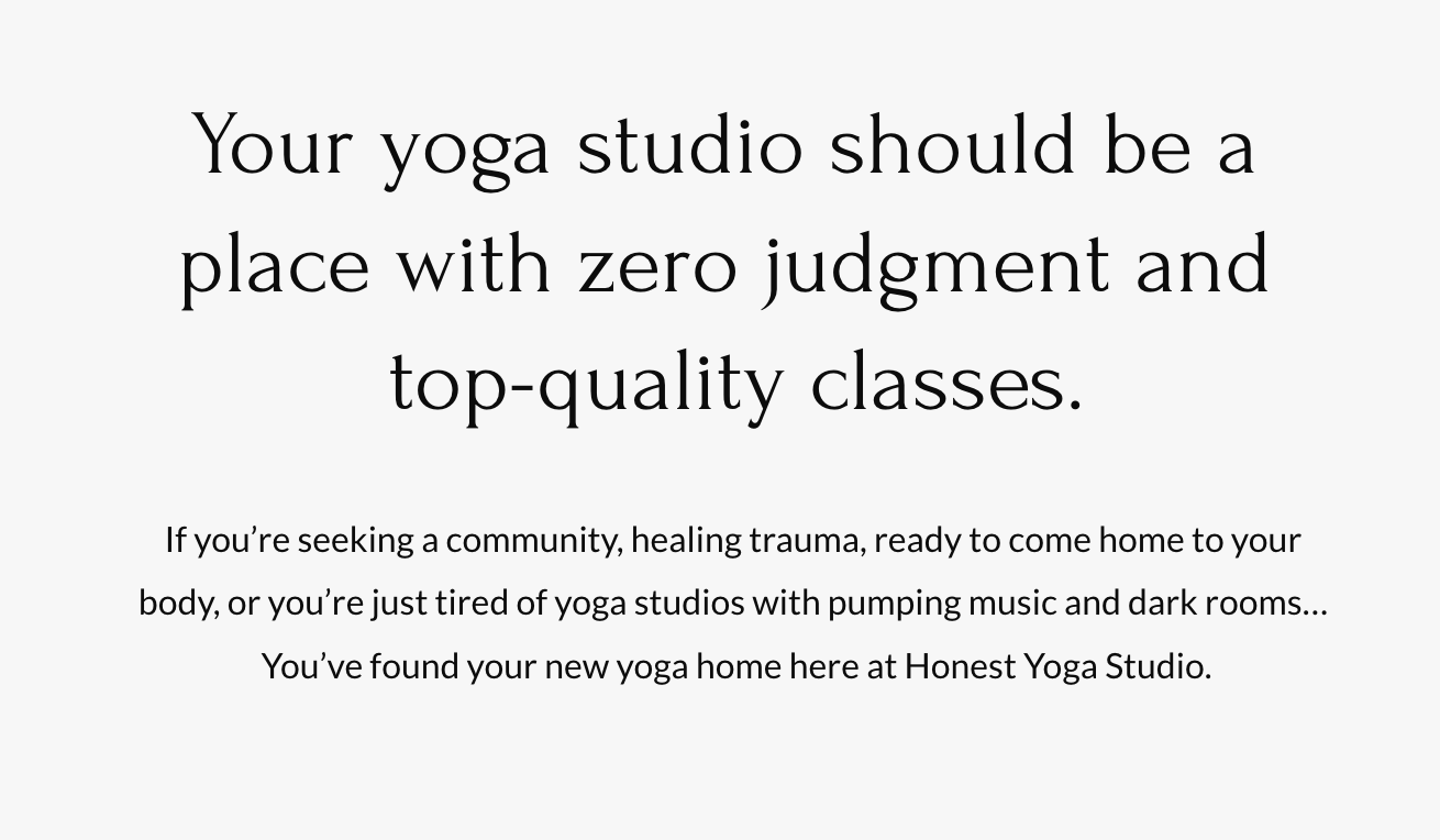
How fun is it to speak like a real person on a yoga studio website?! The most. After going live, Nicole actually had several people comment on how SEEN they felt when they read through the website.
That’s the whole idea!
Project Review
Some of the biggest wins of the project included:
- Created a new brand & guide
- Built an SEO-optimized Squarespace website
- Increased website traffic by 275%
- Grew Instagram followers by 56%
This was such a special project for me, and I cannot wait to watch the success of the Honest Yoga studio, team, and community as they continue to grow and thrive.
If you haven’t yet, you need to follow Nicole’s Instagram where she shares honest takes on motherhood, mental health, and yoga!
The Client’s Review
Belle is not only my marketing guru, she’s my business coach and dear friend. I’m so grateful for how quickly and strategically she created a ridiculously beautiful website that truly sounds like our brand and attracts new members to our community!
After launching the Honest Yoga branding and website, the community was thrilled and the team received countless comments and emails saying how much everyone adored the updated name, visuals, messaging, and website.
Nicole held a 2-year anniversary party for the studio that simultaneously launched the new name and brand. I’m so proud to have been a part of this beautiful project and launch!
If you’re looking for support with your website or branding, reach out to me to start the conversation about working together.
Website Design & Copywriting for Honest Yoga
Copyright 2020-2026 Belle White Creative.
Terms & Conditions. Privacy Policy.
Creating Clarity Across Your Website, Branding, And Strategy
Looking For My Wedding Photography Site?
I also photograph small weddings in Calgary, AB - you can find details and packages on my photography page.