


Dr. Helen Ross founded Aestheva Medical Aesthetics with one question in mind: What would happen if skincare and medical aesthetics didn’t revolve around fear?
She kept coming back to the great privilege it is to experience the fullness of life and how aesthetics and skincare can support a long, happy, confident aging process.
Her community resonated with this refreshing message and her clinic based in beautiful Victoria, BC continued to grow.
She started feeling like it was time for a new website. A website that showcased all her services, which now included hormone therapy along with skincare and aesthetics, and had a more timeless style that would last for years to come.
The Project Goals
Along with a clean, timeless website, Dr. Ross also loved the idea of some refreshed branding to match her vision for the clinic. In the past few years, her team had put a lot of effort into SEO and search ads, so we also wanted to maintain the keyphrases and content to support the rankings they had secured.
Our project goals included:
- Designing a more timeless, modern website
- Adding pages to showcase all their services
- Maintaining the SEO work done by their team
- Refreshing branding for a more minimal, modern look
Another big priority was creating a smoother user experience, especially when it came to the menu navigation and helping people find and book the right service.
The Refreshed, Timeless Branding
We started, as I always do, with a strategy call to kick off the project. We reviewed the visual style I had refreshed based on the initial call and project questionnaire.
UPDATED COLOR PALETTE
The old website and branding were all warm tones and feminine colors, but Dr. Ross wanted a black and white style that would last for years. “Beyond trends” is how we put it as we mapped out the mood board. We took the time to update the fonts, color palette, imagery, and the logos to create a refreshed brand that fit with Dr. Ross’ vision.
THE LOGO REFRESH
We didn’t update the actual design of the logo, just the fonts used in the logo to match the fonts we were using on the website. By making such a small shift to the logo, we allowed more time to slowly transition the branding over time. This limits the launch steps while still creating that refreshed branding.
NEW MESSAGING × VISUALS
As we refreshed the visuals, we also started to draft the core messaging for the brand and showcased what that messaging would look like in the new branding. I always recommend doing this in the design and branding phase – especially when it comes to selecting a font.
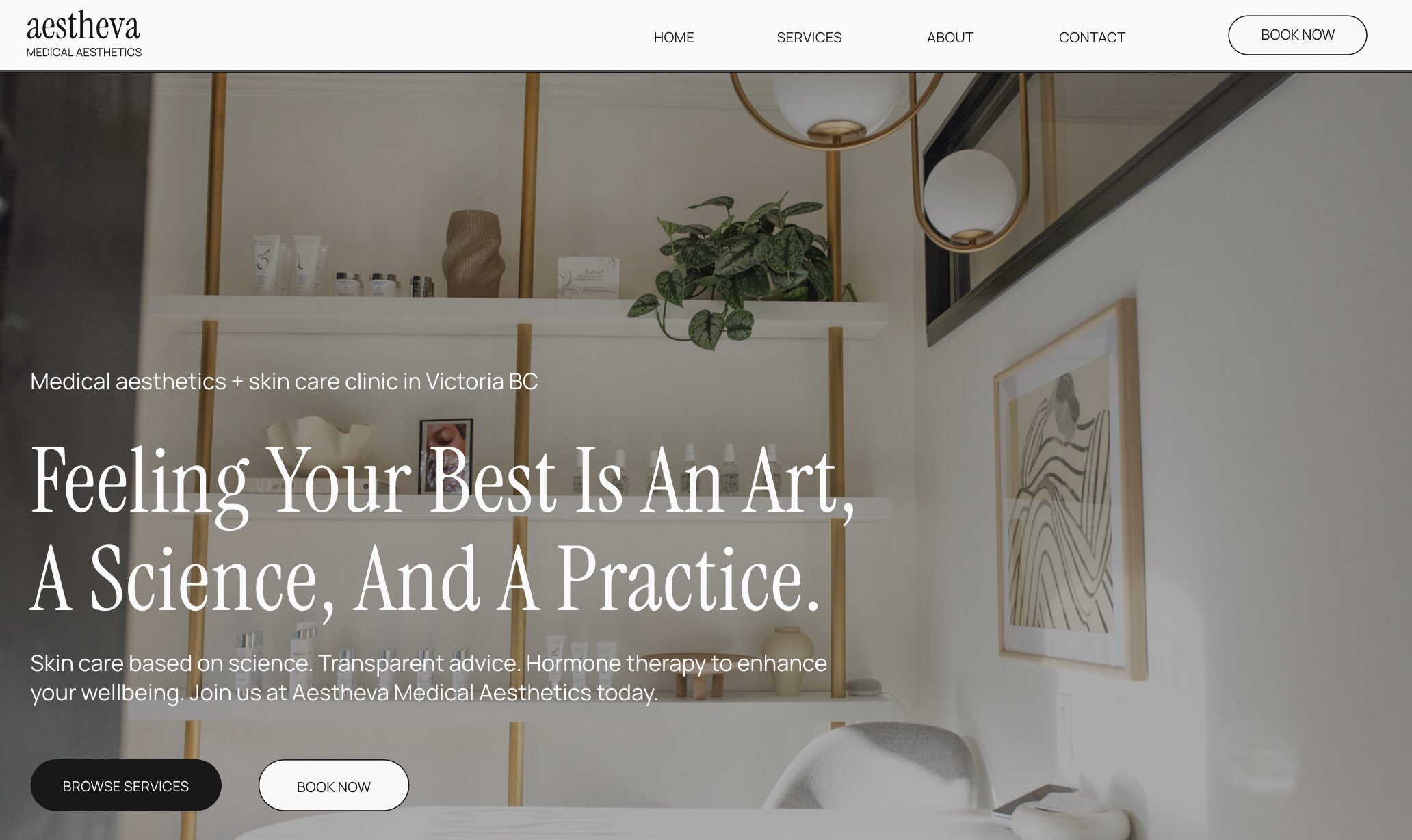
We chose Instrument Serif as the heading font and Manrope as the paragraph font. Both of these are standard Google Fonts, making them an easy font pairing to use for other design needs in the future.
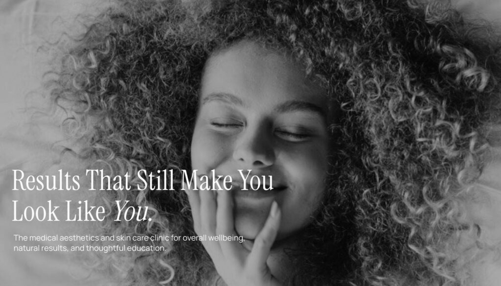
For the imagery, we wanted to avoid looking like every other medical aesthetics clinic with close-up images of needles, so we opted for focusing on the confidence in aging that people feel working with Dr. Ross’ team. We showcased people of different ages and emphasized the feeling of wellbeing with both branded and stock imagery.
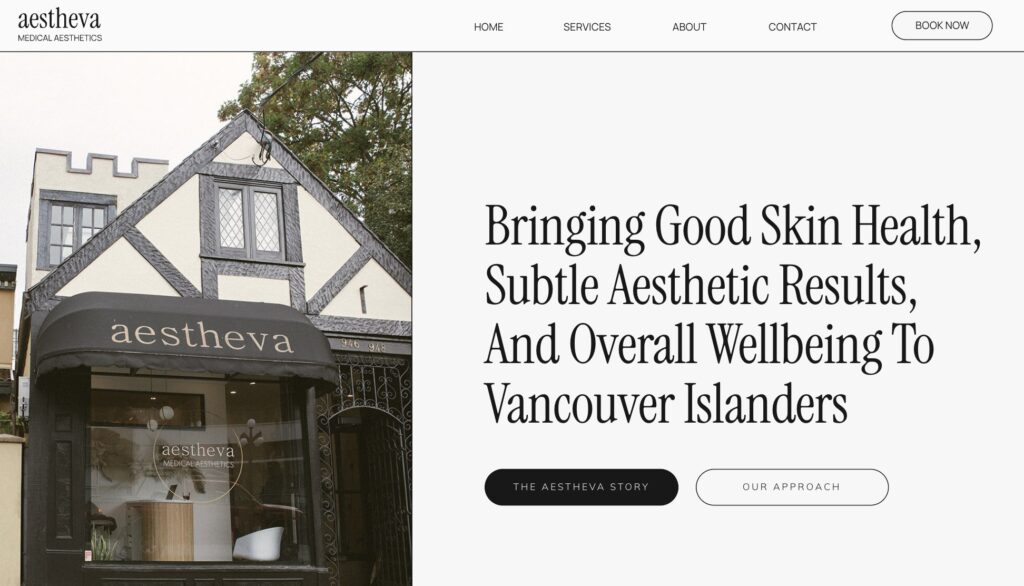
The New Aestheva Medical Aesthetics Website
To make the design of this project a bit faster, we decided to use a template (this one by DeSignorina on Etsy) and fully customize it for a one-of-a-kind design.
THE WEBSITE DESIGN
The feel for this design was timeless, luxurious, clean, organized, and elegant. The imagery, font, and neatly laid-out design created this look effortlessly.
The flow of each page was kept very minimal and clean with smooth transitions on white and very pale grey. The experience on the website is calming, and the minimal color keeps more focus on the imagery and messaging.
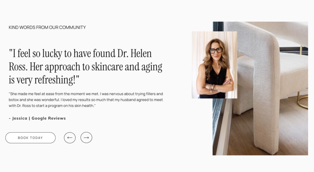
We focused on showing versus telling with the content as much as possible. So instead of saying that Aestheva is a trustworthy, reputable aesthetics clinic, we included beautiful testimonial sections on each page that highlight all the kind words that clients have shared about their time at the clinic.
Having designated pages for each service was another big design decision that allowed for more information on each solution that Aestheva Medical Aesthetics offers – what different treatments look like, starting price point, time of each appointment, and more.
WEBSITE COPYWRITING
To accompany the clean, organized, elegant design, we opted for upfront, honest copy that echoes Dr. Ross’ real-life tone.
To do this, I took notes of exact phrases Dr. Ross used in our calls and the project questionnaire to really sound like her across the website. Dr. Ross frequently mentioned terms like “honesty” and “aging is a privilege,” which made their way into the voice and messaging on each page.
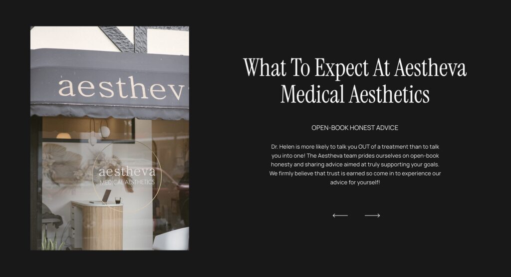
Sometimes, copy just needs to be direct. I love this example from the homepage where we explain just how honest the advice is that you get at Aestheva. We go as far as to say that Dr. Ross is more likely to talk you out of a treatment than into one, which alleviates a common stressor that people feel when attending a medical aesthetics clinic.
With website copy, you don’t want to repeat yourself TOO much. But having certain repeating phrases is helpful for creating memorable messages as someone reads through your website.
We repeated phrases like “Results that still make you feel like YOU” throughout the website in different sections to address a natural concern felt by many people going to a medical aesthetics clinic – that their results will look fake.
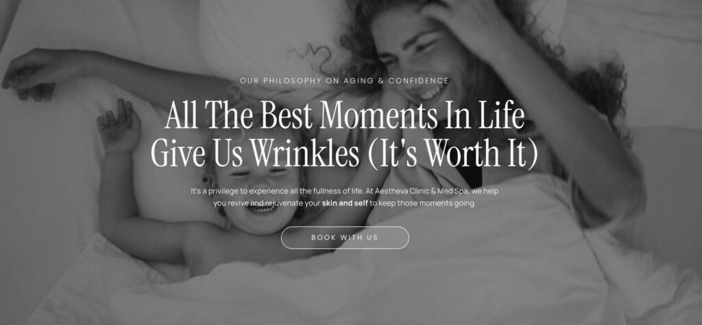
Another focus of the copy was to not shame anyone for wanting to address their skin or appearance. There is a lot of pushy messaging in this industry, and we wanted to stay far away from that and instead focus on the gratitude and privilege of aging and the desire to age gracefully.
My Favorite Part
My absolute favorite part from this project was the unique dropdown navigation menu that stretched across the entire screen and made the user experience so nice and smooth. I also loved how we made the hover effect an underline, making the website feel so modern and clean.
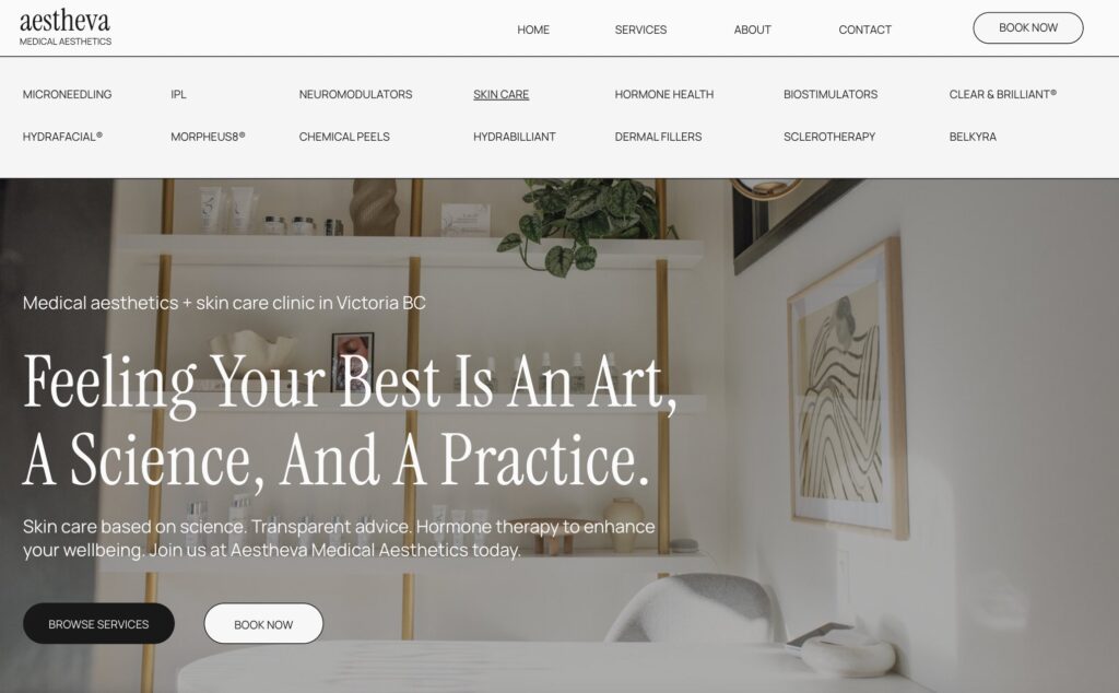
This menu was an addition to the design that allowed people to navigate directly to specific service pages. I love the look and the UX of this menu. It’s rare that a menu is such a standout, but on this website it really brings together all of the project goals.
Project Review
Dr. Ross is doing such amazing things with the Aestheva Medical Aesthetics clinic, and I absolutely adore her philosophy on aging, beauty, and confidence.
Working with her to create a visual brand and website that showcased her philosophy clearly and beautifully was such an honor!
CLIENT TESTIMONIAL
“This is fabulous, all thanks to Belle! I love the clean and bold aesthetics of the branding. We could communicate freely and easily with her and the work she did was stellar!”
— Dr. Helen Ross, founder of Aestheva Medical Aesthetics
Looking for a fresh new website, copywriting, or branding? Reach out to start the conversation about working together!
Other Blog Favourites

Copywriting
How To Write Your Services Page

Marketing
Personal Branding on LinkedIn

Copywriting
How To Improve Your Web Copy

Websites


