Sep 15, 2024
Orchatect is the team dedicated to helping multi-location businesses manage their financials and operations better.
Or, as they proudly shared with me in our first call, they’re a team of tech, data, engineering, and consulting folks who noticed that smaller & mid-sized businesses needed access to the same tools as Fortune 500 companies.
So they built them!
Specifically, they created The Maestro® Solution, a dashboard that takes all the tools, data, and spreadsheets you already use for your business and brings them together.
The Project Goals
Getting to work on the new Orchatect website was such a fun learning experience for me. I got to see behind the scenes of some pretty amazing SaaS tools and really understand how the right technology and workflows can save both money and time.
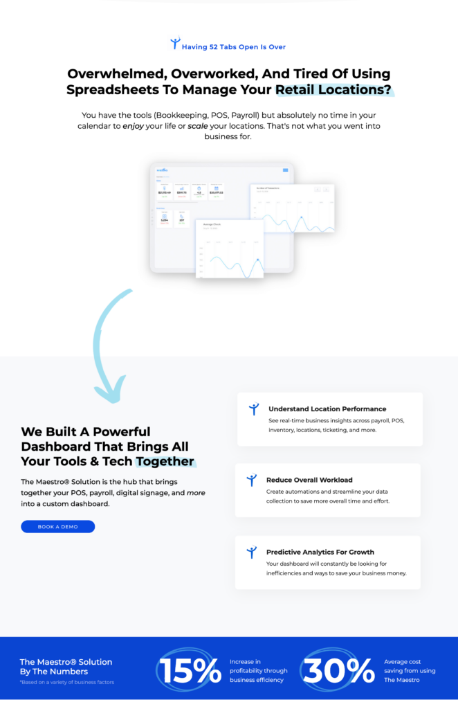
I was also reminded of how important it is to speak directly to your ideal clients in terms they understand! Focusing in on the key pain points that this team solves and writing them out clearly was a big highlight of this site.
The big goals of this website project were to create a website that communicates the Orchatect team’s mission, solutions, how they help multi-location businesses, and increase their demo call bookings.
Branding + Design
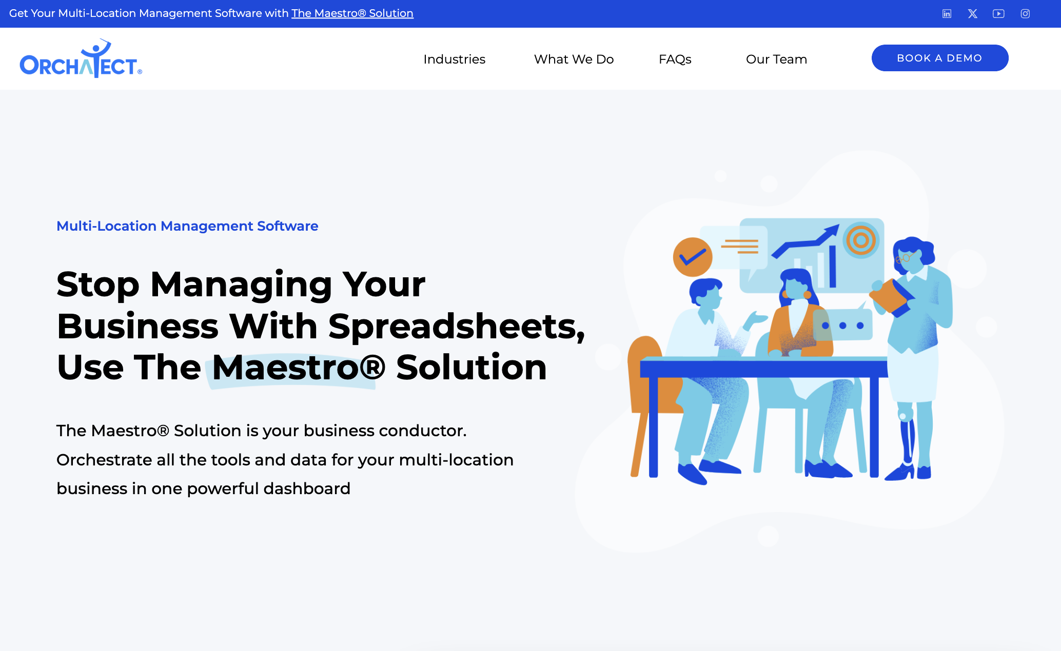
For this new website, we wanted to create a more consistent, modern design style that would scale with them into the future. We chose to use their bold blue as the highlight color throughout the website.
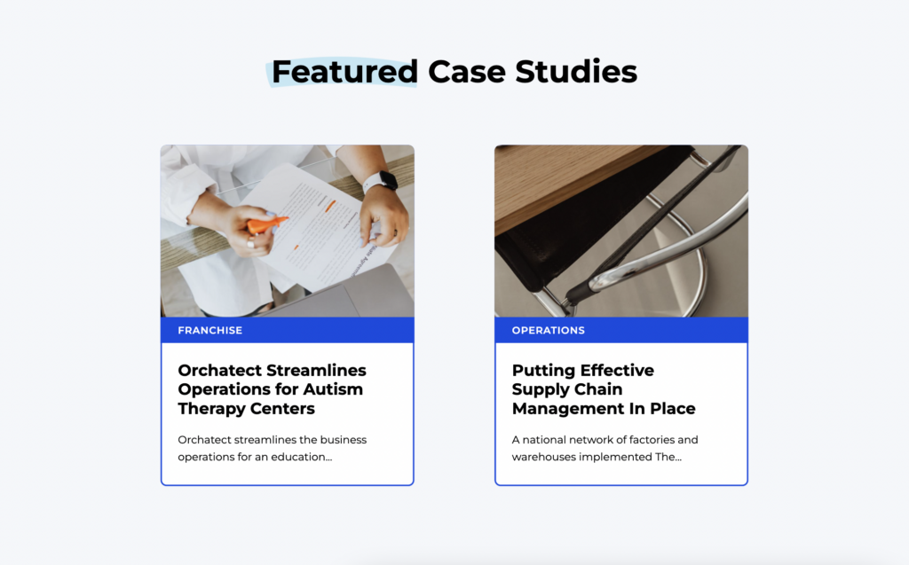
We used moving graphics of their signature logo, the ‘Maestro’ man (he orchestrates all elements of your business), and used some fun elements like hand-drawn arrows, circles, and text highlights.
We kept the remainder of the website pretty modern and sleek and the result is a wonderful combination of dynamic elements and important information for potential clients to review.
Website Copywriting
The way we wrote this website was all about explaining what The Maestro® Solution does and how it helps multi-location companies across different industries.
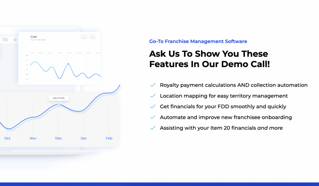
We decided to write a landing page for each industry they serve (or at least the primary ones!) so we could speak directly to their pain points and improve the Orchatect SEO across industries.
The case studies were another great touch for showcasing results for specific industries.
The thing we wanted to avoid on the website was adding too much information. Orchatect helps with so many areas of location management because they build out custom solutions but we didn’t want to overwhelm our readers.
We went through the website carefully to ensure we had lots of information and results, but that we weren’t overloading each page.
My Favorite Part
I’m all about writing in a way that is easy to understand. Sometimes we just need to speak the way we would over a coffee to a friend. This section of the website is such a perfect example of that idea!
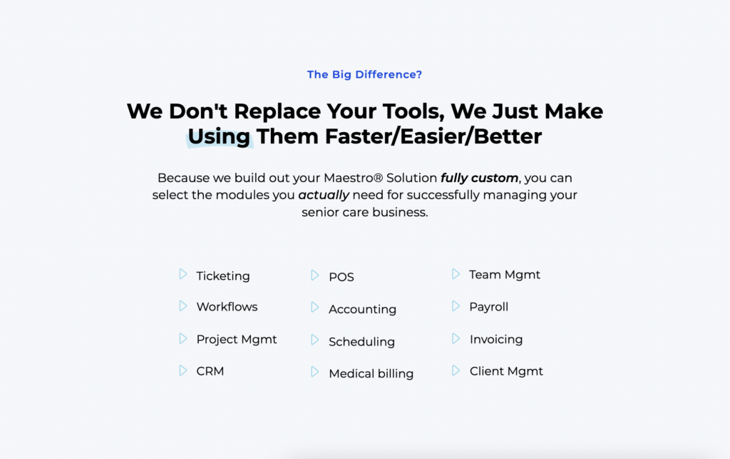
One of the biggest questions the Orchatect team gets about The Maestro® Solution is ‘Does this replace my current tools like Quickbooks or our CRM? I like my tools and don’t want to completely replace them.’
I love how this section addresses this question head-on in very clear, plain language! “We don’t replace your tools, we just make using them faster/easier/better.”
It’s the exact direction we wanted to go with the website copy.
Project Review
I’ve decided I absolutely love working on SaaS websites!
This team is so driven to bring the very best software and tools to mid-sized businesses. It was inspiring to speak with them, hear their passion, and then bring that out on this website.
I never tire of getting to help businesses speak their solutions clearly so they reach the right people!
“I can’t stop looking at the new website! It looks just awesome and Belle was absolutely incredible to work with – so helpful at every step of the process!”
— Monty, co-founder of Orchatect
Looking for a fresh new website, copywriting, or brand strategy? Reach out to me to start the conversation about working together!
Website Design & Copy Project For Orchatect
Copyright 2020-2026 Belle White Creative.
Terms & Conditions. Privacy Policy.
Creating Clarity Across Your Website, Branding, And Strategy
Looking For My Wedding Photography Site?
I also photograph small weddings in Calgary, AB - you can find details and packages on my photography page.