Apr 12, 2024
The first project after you re-launch (or refresh) your business is a big one. It sets the tone and kicks off a new ‘era’ of your business and work.
So when Megan of Rosen Franchise Consulting (RFC) reached out to me for a brand and website project RIGHT as I re-launched Belle White Creative, I was thrilled.
Megan is a dream client. She had a vision for her brand and (new) business but she was also open and flexible to the strategy and insights I brought to the table.
The Project Goals
Rosen Franchise Consulting is a personalized consulting agency for small business owners who are interested in franchising their business, but want guidance through the process to avoid costly mistakes.
Franchising means setting up your business to be a set of systems/processes/branding that other people can invest into and start their own location. Popular examples include McDonalds, Subway, Orange Theory, and more.
Franchising a great way to grow certain types of businesses, but taking the step from business owner to franchisor is a big one that is way easier with the guidance of a consultant.

Megan (the lovely founder) has over a decade of experience in the franchise industry, but was justtt starting out on her own in the consulting space. She wanted a brand and website that helped her:
- Showcase her personality and experience
- Clearly share her value and packages
- Speak directly to her ideal clients and their challenges
- Stand out as a modern, fun consultant in the industry
We decided in our discovery call that RFC would be a perfect fit for The Basics website package + a branding package that included logos, brandmark, colors, fonts, key messaging, and imagery.
Branding + Design
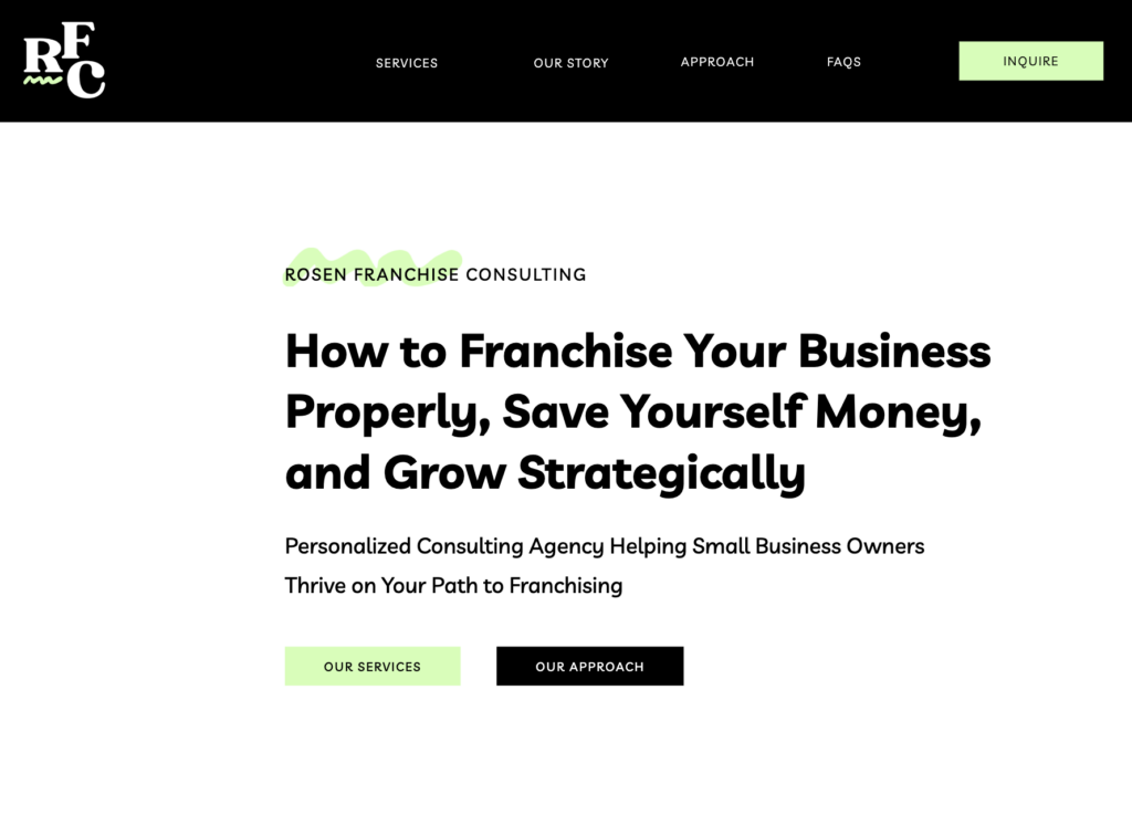
The inspiration behind Rosen Franchise Consulting is a mix of personality (Megan loves booking flights, mountain hikes, disco balls, and big sunglasses) and modern consulting (clean design, bold colours, and transparent packages).
For Megan’s branding, we leaned towards a sense of leaping into the next adventure in your business (which is exactly what business owners stepping into franchising are doing) with the bold green and strong vintage font.

The thing I wanted to avoid was making the RFC branding look too natural and earth-toned (fairly common issue with a green color palette) so we explored several options before deciding to incorporate highlighter green.
The highlighter tone, and adding some more black to the web design, worked really well to adjust the palette from an earthy palette to a modern agency feel.
The Website Copy
You’ll notice the website copy includes a lot of references to adventure, travel, and road trips to tie into the journey that business owners experience as they enter the franchising space (it can be quite the adventure!)
The copy is also very minimal (not too many words on the page) that focus on clearly identifying who RFC serves, the challenges they’re experiencing, the package options for working together, and the benefits of working with Megan.

Typically, the RFC clients will be problem-aware, meaning they know about franchising, are interested in learning about the process or have already started, and know their challenges.
They’re seeking information on the solution for how to franchise better, save money, and make the process smoother.
The Problem-Solving
Challenge: Social Proof
One of the main challenges for any brand new business is how to provide social proof for your methods/services/packages when you don’t have a big bank of testimonials or results from past clients.

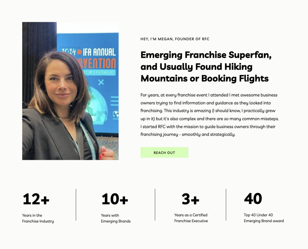
For Rosen Franchise Consulting, I opted to showcase Megan’s experience and validation through data points right under her mini about section. These data points highlight RFC’s social proof and connect directly to Megan’s story above.
Challenge: Personality vs Professionalism
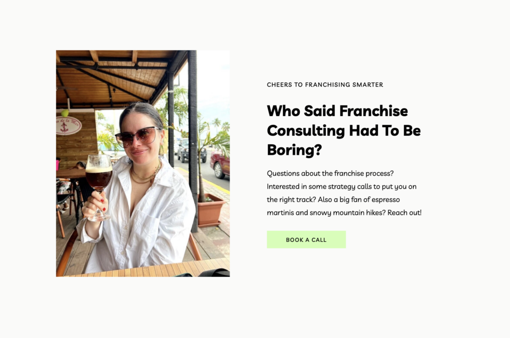
Megan is a really fun human, with a personable demeaner and a love of espresso martinis.
Because the RFC clients will be working closely with her, the goal of the website was to feel very personality-packed so you feel like you know Megan on a friend-level.

But we also want this website to be a modern agency, and be scaleable in the future.
Sooo we focused on keeping the design very clean/modern/bold and let the copy speak from Megan’s POV to incorporate that personality into the site.
My Favorite Part 🙂
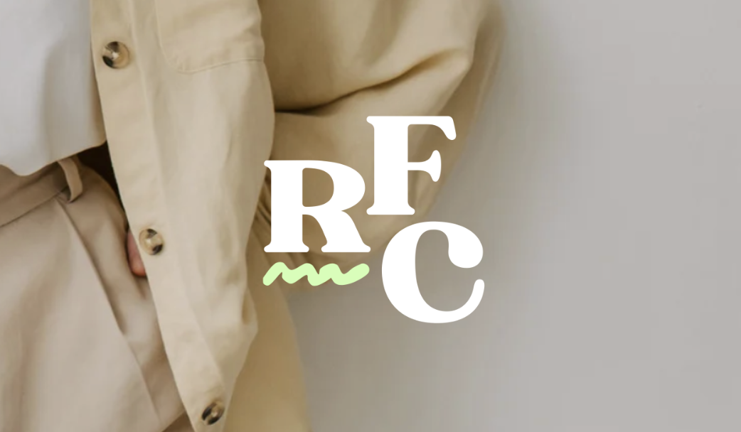
The logo elements (specifically the hand-drawn squiggle and wavy line) represent the journey of businesses as they shift into franchising – from a tangled web to a more linear path.

I loveeee a hand-drawn element in any branding. The squiggles actually ended up being one of the top feedback points from Megan’s network once she launched her branding.
Everyone loved the look, and it’s special that there is also an explanation as to the why.
Project Review
I’m so proud to have been a part of the launch of RFC and getting to work with Megan on her new business while I was re-launching me new-and-improved business was beyond special.
The Client’s Review
To say this package is worth every penny and that Belle over delivered would be an understatement. From the beginning, Belle was enthusiastic about the project!
She communicated the timeline and the process very clearly and made the entire experience so easy.
Once we started Belle was super easy to get ahold of and most importantly, she captured my personality perfectly and efficiently. I could not be more happy with how my branding, website and copywriting came out! 10/5 stars for Belle!
I’m so excited for the businesses that will get insights and guidance from Megan as they navigate the journey into franchising – saving dollars, stress, and time on the path to their goals!
Thanks for reading the project review! If you’re looking for support to refresh your website or start a new brand, reach out to me to start the conversation about working together 🙂
Brand & Website Project: Rosen Franchise Consulting

Copyright 2020-2025 Belle White Creative.
Terms & Conditions. Privacy Policy.